

October 4, 2026
Tone Pro is headed to the Portal!

This week’s Warhammer preview is headed for the painting desk.
Warhammer Tone Pro takes the spotlight with 150 paints, two supporting mediums, and four new drybrush sizes. Following its September reveal, Games Workshop is putting the complete painting system at the center of its next release preview.
The appeal is not simply having more colors to choose from. It is making those choices easier, then giving painters more ways to use the colors they pick.
Less Guesswork, More Painting
Tone Pro organizes 30 color families into five numbered tones, running from the darkest at 1 to the lightest at 5.
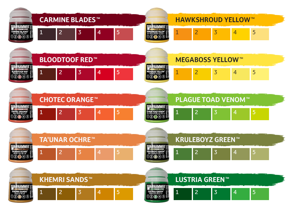
The accompanying charts show how that works across families such as Bloodtoof Red, Hawkshroud Yellow, and Lustria Green. Rather than remembering several unrelated names for a shadow, base color, and highlight, the relationship is visible within each family.
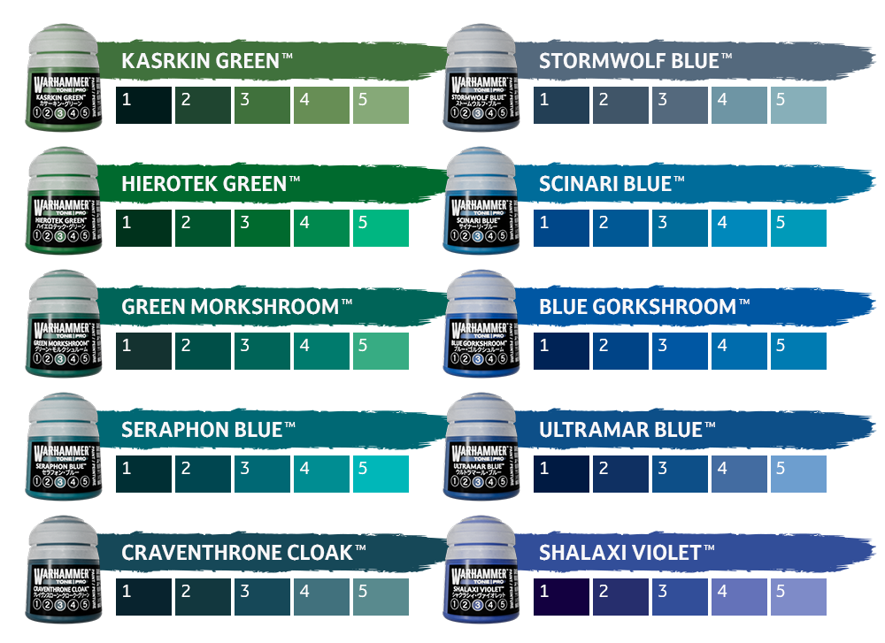
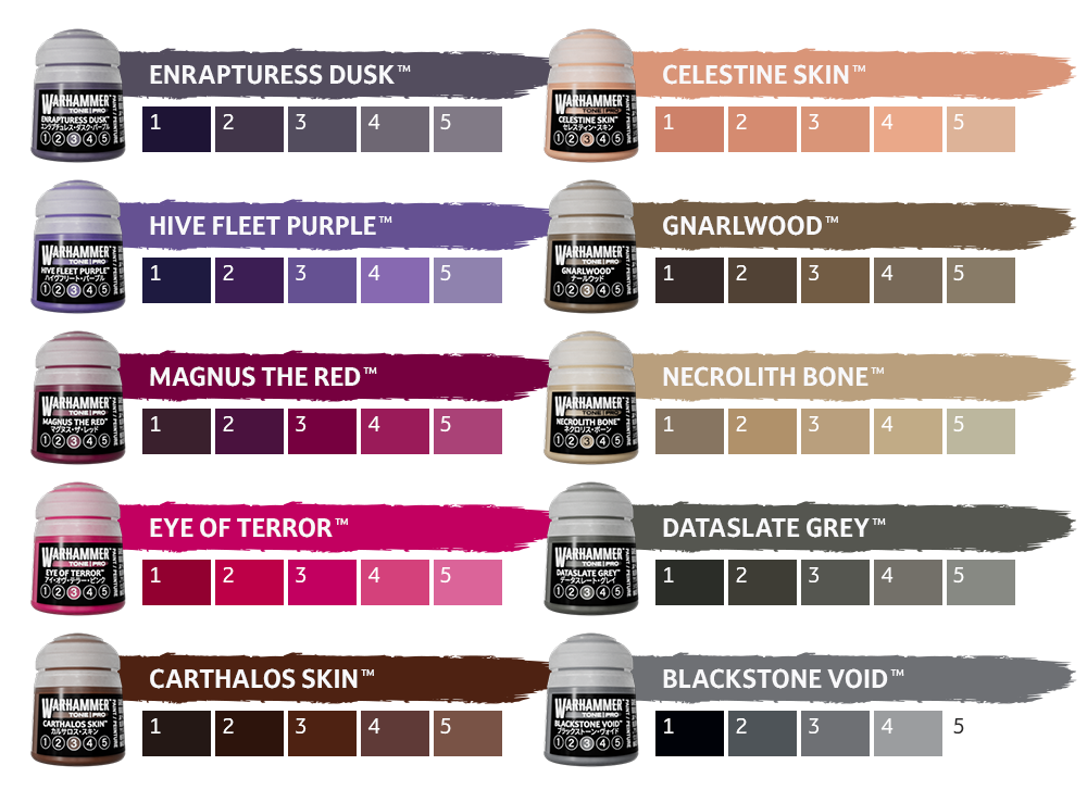
That is useful for more than getting started.
Imagine returning to an army after a few months away. Having a clear progression makes it easier to record what you used and understand where another highlight would fit without rebuilding the recipe from scratch.
It is also a guide, not a requirement to use all five tones on every miniature. A straightforward squad scheme could use a smaller selection, while a character project might benefit from more gradual transitions.
The system gives you a starting point without deciding the entire paint job for you.
More Than a New Label
Games Workshop says the new formulation supports basecoating, layering, highlighting, glazing, and drybrushing.
That is the part we find more interesting than another row of paint names.
A color that works across several techniques could become something you reach for throughout a project, rather than a pot reserved for one specific step.
The latest preview also emphasizes self-levelling properties and strong initial coverage, including from yellows and whites. Those are GW’s performance claims, not a hands-on verdict from us.
What matters will be how those qualities work together. Strong coverage is appealing, but so is being able to build a smooth transition without the paint fighting you. The most useful result would be consistency across both jobs.
Two Mediums, Different Jobs
Shading Medium and Blending Medium support the range, but they serve different purposes.
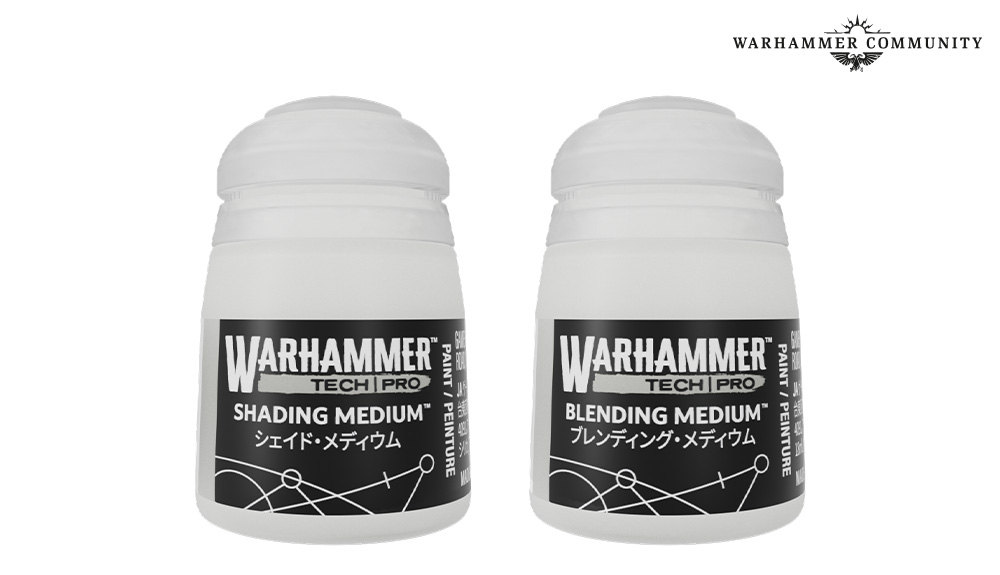
GW describes Shading Medium as reducing pigment density while retaining the paint’s flow and finish characteristics. It is intended for turning a chosen Tone Pro color into a shade or glaze.
Blending Medium extends drying time, giving you longer to work colors together.
In practical terms, one is about transparency and the other is about working time.
We like that distinction because it encourages painters to think about what they want the paint to do. A transparent tint and a slowly worked blend are different tasks, even when they begin with the same color.
Drybrushes Join the Range
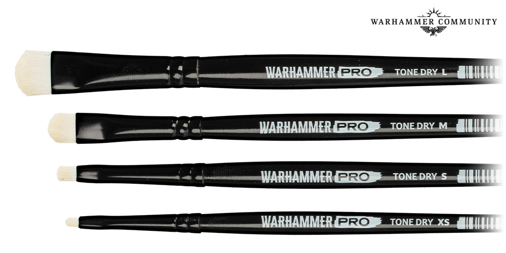
The new Tone Dry brushes come in XS, S, M, and L sizes. GW highlights their curved tips and closely packed bristles as features intended to improve control.
The product photograph shows a clear spread from a narrow detail brush to a much broader head.
That variety is welcome. Working around a small area of textured armor and covering a large scenic base should not have to feel like the same job with the same brush.
Whether these become regular workbench favorites will come down to how well they load, release, and place paint. For now, they round out the range with something more purposeful than a single general-use drybrush.
A Chance to Try Them
Games Workshop says demonstrations are already running at participating Warhammer stores and independent hobby shops. That includes us, so come by and visit our new location and try them for yourself!
That is a useful opportunity with a release like this. A numbered color chart can explain the system, but handling the paint is what reveals whether its consistency suits your approach.
For us, the worthwhile questions are straightforward: how does it cover, how does it behave when adjusted for another technique, and how easily can you repeat the result?
Our Take
Tone Pro’s strongest idea is making a large paint range easier to navigate without limiting what an individual color can do.
The numbered families provide structure. The mediums offer different ways to work. The brushes add a range of sizes rather than asking one tool to cover everything.
The real test will be whether those pieces make painting feel more straightforward across a complete project.
An impressive rack of paint gets your attention. A handful of colors that consistently do what you need are what earn a permanent place on the desk.